← Index  ·  Personal project

Straight up:
is it worth
seeing in IMAX?

IMAX or Not (beta) is for when you can’t be bothered opening seventeen tabs. What’s on, tap a film, get a scorecard that says if the upcharge is probably worth it.

Year
2025 to 2026
Role
Product, UX & UI
Solo side project
Surface
Responsive web
imaxornot.com ↗
Focus
Decision clarity for premium cinema · Transparent scoring
IMAX or Not home: Now Playing in IMAX grid with gold, silver, and bronze film cards

01 / Problem

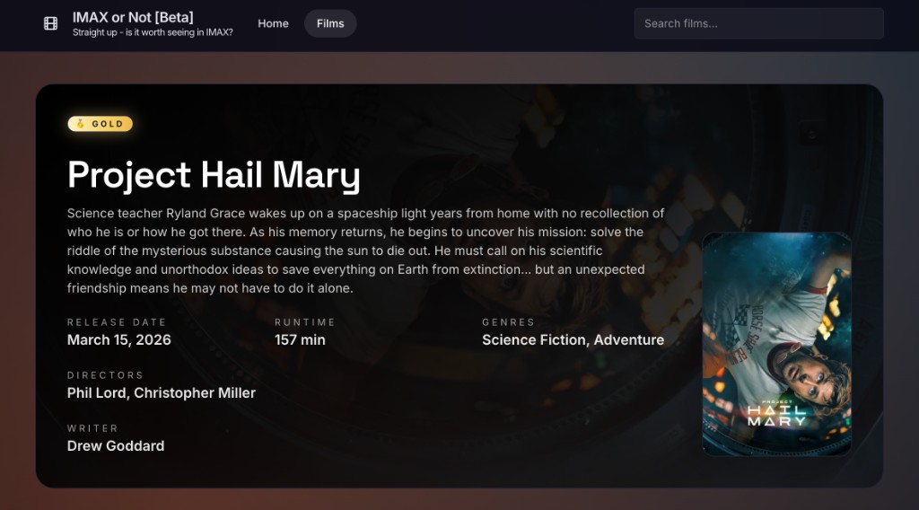
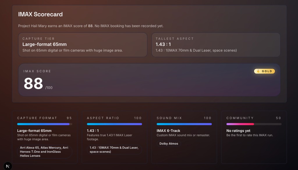
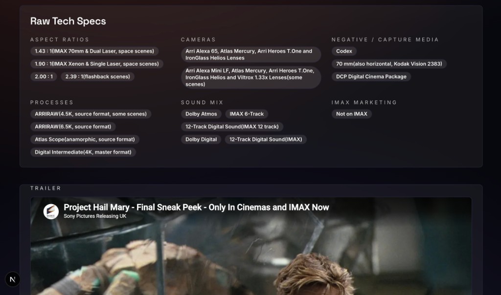
“Filmed for IMAX” is basically marketing soup — not one reliable guarantee — and that sucks when you’re about to pay extra.

Capture format, aspect, sound mix: they all change what you’re buying. Normally that lives across trades, wikis, and Reddit threads. If you just want a yes/no before the 7pm show, hunting it down is tiring.

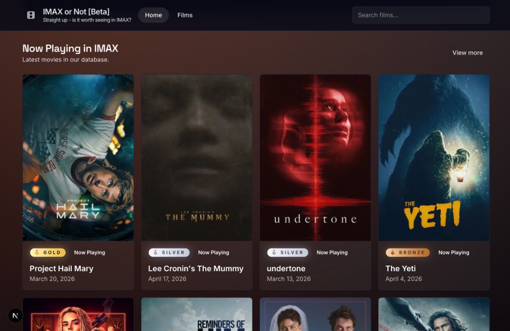
So the product is dumb simple: one page with the technical story, gold/silver/bronze for at-a-glance, and the full spec list underneath when you want to argue with your mates.

  • Faster “should I upgrade?” decisions at the moment you’re buying.
  • Less tab-hopping and second-guessing after you’ve already paid.
  • Honest detail for people who care about specs, without gatekeeping everyone else.

02 / Approach

The score is explicit — you can argue with it, it’s not a black box.

IMAX score = capture + aspect + sound + a bit of crowd signal, so the headline always ties back to inputs. Medals for the grid; pills for cameras, aspect, mix, so it doesn’t fall apart on a phone.

Film page is poster/synopsis/crew plus a tech specs grid (aspects, cameras, neg/capture, processes, sound, studio marketing flags). Trailer embed so you’re looking at the actual release, not a vibe board.

  • At a glance: is this a “treat yourself” screening or a mild upgrade?
  • One scroll down: the evidence if you want to argue with friends afterwards.
Film detail for Project Hail Mary: hero card with synopsis, metadata, poster, and gold badge
Film page: poster, synopsis, and tier at a glance.

03 / Visual language

Visual goal: lobby energy, not “Notion but for movies.”

Charcoal + brown so poster art does the colour. One medal shape reused for all three tiers. Scorecard gradients hint “premium” without making the numbers unreadable.

Tight label → value rhythm (small caps / bold answers) so spec dumps don’t turn into mush on mobile.

  • Content-first: the UI gets out of the way of art and typography from the film.
  • Readable at arm’s length when you’re half watching a trailer on the couch.
IMAX Scorecard: overall score, capture tier, tallest aspect, and four metric cards
Scorecard: headline score, capture tier, and metric cards in one rhythm.

04 / Status

Live beta — catalogue and scores will wobble as new prints and ratings land.

Next up: sharper sourcing, better search, fiddling with how much “vibes” should nudge the score vs hard specs — still the same goal: pick the right screen without bullshitting you.

  • Shipping messy in public so people can tell me what’s wrong.
  • Doubling down where “do I trust this?” actually matters.
Raw tech specs columns and embedded trailer section
Specs depth and trailer block on the same film page.
Live site

imaxornot.com
Open beta ↗

IMAX or Not